
9 Impressive Restaurant Logos To Take Inspiration ...
For any offline or online brand, a logo holds utmost importance. That’s because it shows a personality and the image a brand wants to portray in front of the general public. We can guarantee that there is no business in the world that doesn’t have a logo.
While anyone can design a basic logo, it requires a deep understanding to design a logo that gets etched into peoples’ minds. There are very few logos in the world that manage to do it. And even fewer designers who can design such logos.
From clothing to restaurants, every business aims to have logos that stay in peoples’ subconscious memories. We feel restaurant logos need to be unique and invoke a certain feeling in peoples’ minds because it will help them earn profits.
We recommend you read today’s blog if you also have a restaurant. That’s because today, we’ll tell you about 9 impressive restaurant logos you can take inspiration from. You’ll have more ideas than ever after reading this blog.
Let’s start.
Smart Cook
Smart Cook is a restaurant business that has a unique logo. The first time you look at it, you’ll know what we’re talking about.
Closely look at the two O’s. The two dots you see between them are the eyes. Where you see ‘smart’ written, that’s the cap, and the tilted lines below the O are the moustache and beard. This clever logo is designed by keeping the most important thing in a restaurant in mind.
Thai 76
Thai76 is a restaurant based in Thailand that has a unique logo. At first sight, you may see a simple text and nothing else. But when you look closely, you’ll see an elephant. But what is an elephant doing in a restaurant logo?
There is an elephant in the logo because Thailand is known for its elephants. The country is famous worldwide, and we believe there is nothing better they could’ve done to show the authenticity of this restaurant.
Ramen Racine
Ramen Racine is a restaurant in the USA that has a unique logo. No, you don’t have to look at the logo multiple times to know what we mean. You’ll see it in the first go. Take a look between the chopsticks and observe the shape of ramen. They’re shaped in the letter R, showcasing the initials of the restaurant’s name.
This is a nice touch, and the designer who created the logo knew what they were doing. They did proper research so that they could let the restaurant deliver the image they wanted to.
Boulevard Barbeque
As the name suggests, Boulevard Barbeque is a restaurant specializing in barbeque. When you look at the logo, you’ll immediately know that this restaurant also specializes in serving beer. How would we know? We know because a restaurant would only showcase something in their logo when they’re really proud of it.
Anyone who loves barbeque and is wondering whether beer would be served can look at this logo and immediately know that it will be served. We feel this is an amazing logo that more designers should strive to design.
Major Wood BBQ
Major Wood BBQ’s logo is amazing in more ways you can imagine. It doesn’t have one unique thing but a number of things that once you start discovering, you’ll start appreciating how great of a design it is.
When you look at it, you’ll see the things that a person commonly sees in the woods (forest). You’ll find water, an axe, a knife, and fire. This logo perfectly shows the restaurant's authenticity and how it is perfectly using these things to give an amazing food experience to people.
The Fat Duck
The Fat Duck is a restaurant that serves ducks to the people. They’ve shown the various parts of duck in their logo. The fork, spoon, and knife you see in the logo are designed to resemble a duck’s claws, fin, and tail.
We applaud whoever designed this logo because they’ve perfectly used the restaurant’s name and designed a logo that depicts what the restaurant is all about. We urge all you designers out there to take inspiration from this logo because it really is an excellent logo that is rare to find.
Domino’s
The last three restaurant logos are some famous restaurant brands that most of you may already know. The first famous restaurant logo we’re talking about is the most popular Pizza chain across the world- Domino’s.
This is a household name in The United States of America and many Asian countries. No matter which new pizza company comes into the industry, Domino’s has been at the top for quite a long time. And seeing the quality they provide, it’s hard for any pizza restaurant to beat it.
Let’s talk about the brand’s logo. The logo was designed in 1965 when they had three chains in the USA, thus the three dots. Most people don’t know the meaning behind it. We hope most people do now because it is only natural for them to know their favourite brand’s logo.
Chick-fil-A
Chick-fil-A is an American restaurant chain that specializes in chicken sandwiches. They’re known across the country for their tasty food. Apart from their delicious sandwiches, they also have an amazing logo.
You just have to look at the first letter ‘C’ and you’ll identify that there is a chicken’s face designed using the letter. There is a small dot inside ‘C,’ which is the chicken's eye, and there is also a beak just above the letter ‘H.’
Chick-fil-A truly is a fantastic logo that more designers should take inspiration from.
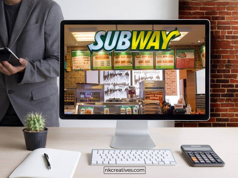
Subway
Subway is a fast-food franchise that has the most outlets in the world. Although we call Subway a fast-food franchise, it is known for its healthy salads and subs. There was a man who survived for entire month eating subs. The man didn’t face any health issues, which goes to show that they indeed use healthy bread and fillings.
Subway’s logo has evolved a lot over the years. The arrows in the letter ‘S’ and ‘Y’ have been there since the first time the logo was designed. It is still present in the most recent logo. The arrows aren’t just randomly put in the letters because they serve a purpose. The reason there are arrows shows that you quickly come into the restaurant and quickly get out of it by getting your order. They show how quick their service is.
Their logo is a subtle use of their best quality, i.e., quick delivery.
Conclusion
Any person looking to start a restaurant business needs to make sure that they design a logo by keeping their services and the audience they’re targeting in mind. Without them, there is a slim chance that their logo would put an impact on anyone.
In this blog, we told you the reason behind 9 restaurant logos. Some of these restaurants are famous while others are not so famous. After knowing the reason behind these logos, we're sure that you’ll have more ideas to design restaurant logos.
