
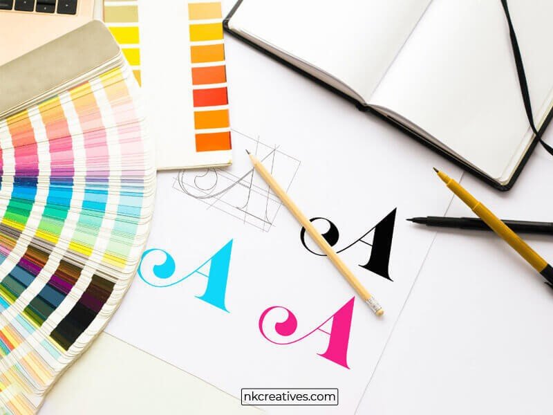
Typography: Your Guide To Everything Related To Text
You may have heard the word typography getting used on design websites. Let’s be honest here: you never really understood what typography meant. We feel you. It’s pretty common for regular people to get confused when they hear such a term.
So, what is typography?
Typography is basically the style, size and appearance of letters. It is everything related to text and other things you hear about text (fonts, typeface, font family) comes under it. Don’t worry, because we’ll be telling you about all these terms. This blog is about typography and everything related to text. So, we guarantee that you’ll learn something valuable after reading this valuable.
Let’s begin.
Different Terms In Typography
First, let’s discuss the different terms in typography. Once you know them, understanding complex concepts in typography would become pretty easy.
Typeface
The typeface is the different type of text that you right now call fonts. Most regular people call the different types of text as fonts, which is irritating for a designer because they know that typeface and font are different.
Calibri, Arial, Helvetica, and Georgia are all different typefaces and not fonts. A font is something different which we’ll tell you about in the next point.
Font
A font is a style for a typeface; for example- Calibri is a typeface, and Calibri light, Calibri bold, Calibri semi bold and other styles of the typeface are called font.
We know you may be getting confused right now because whatever you knew about fonts was wrong. But don’t worry because you’ll get a very clear picture of typography by the end of this blog.
Font Family
You can easily understand what font family is when you know about fonts. In the previous point, we talked about different styles of fonts. When you combine all those different font styles, it becomes a family and is therefore called the font family.
Any typeface you use has a family. And like a real-life family, the fonts best complement each other when one family is used for a webpage or a creative post.
Weight
The real difference between fonts comes because of the weight. In typography terms, weight means the thickness of a font. The light, bold, and black fonts are the result of an increase in weight. Designers change font weights frequently.
Now, you may be wondering why anyone would use weights when there is an entire family available to choose the thickness from?
Designers use font weight because sometimes they have to use a font’s thickness that is not available. By increasing or decreasing weight, they can easily get the desired thickness.
Leading
The vertical distance you see between two lines in a paragraph of text is known as leading. No, it isn’t a default setting that people don’t pay attention to. Most designers who want their designs to look good pay attention to leading and adjust it so that the text looks good and the readability increases.
If there’s a website with a lot of content, it is recommended to experiment with leading and find a suitable one so that people can easily read the text. Often, websites have really good content, but they ignore leading and don’t get the desired results. So, we highly recommend you experiment with it and find one that suits your website.
Tracking
When we write two words, the space between those words is called tracking. Like with leading, many people also leave this to the default setting. A regular person may not understand the problem with a text when they look at it. They can’t pinpoint it because they don’t know anything like tracking, and the space between words can be adjusted.
We highly recommend you start taking care of tracking to increase the impact of your text.
Kerning
Kerning is similar to tracking because it is the space between two letters. Now, most people might think that kerning has no use. But it isn’t so because sometimes it is required to adjust the spacing between letters to make the text look more readable.
Many people think that you have to adjust kerning first and then tracking and leading. But that’s not the case. You first have to adjust tracking and leading and then work on kerning. If you work on kerning first, tracking will mess up all the changes (the spacing between letters). So, take care of this point when making changes to the text.
Importance Of Typography
We know everything related to typography terms. Now, let’s discuss the importance of typography.
It Holds Readers’ Attention
Typography is essential because it holds readers’ attention on a website. We all can agree that not everything in a text is important. Some parts of the text are more important than others. Because of this, it becomes crucial to highlight the important parts. And when you highlight the important parts, it helps hold readers’ attention.
For example, when giving some examples, you can make the text italic (that’s what we did here). And when writing something that you want to make an impact from, make the word bold.
These variations are essential because plain text is boring, and no one would read it, meaning all the hard work of the content writer will be wasted.
It Helps Convey A Feeling
You can actually convey different feelings with the text. When you use a formal and plain typeface, it conveys a serious feeling and readers understand that something that you’re telling should be taken seriously.
On the other hand, using a playful and funny typeface will give the readers an informal and fun feeling.
You don’t have to use a specific typeface everywhere on your website and social media handles. The typeface will change according to the feeling you want to convey.
It Helps People Recognize You
People start relating a typeface with your brand when you use it on your website or social media handles for an extended time. Yes, it really happens. You can become a well-known brand because of the consistency with a typeface.
Every brand aims to become popular and a familiar name among people. So, if you can get popular because of the text, then there’s nothing better than that, in our opinion.
Conclusion
Typography is a simple concept, yet people across the globe find it hard to understand. The reason for it is the complex name. If only designers and other experts called typography simply text, regular people would easily understand all the concepts.
Let’s leave changing the name of typography to experts, and let’s only focus on teaching more people about it. In this blog, we explained all the complex terms in an easy language so that maximum people could understand them.
If you liked reading this blog, share it with your friends, and other people you think need this knowledge.
