


10 Business Card Design Mistakes You Should Avoid
Your business card often serves as your first impression. It speaks volumes about your professionalism and brand. Avoiding common business card mistakes ensures a strong impact.
Thoughtful Business card design is crucial for success. Let's explore ten pitfalls to steer clear of.
1. Overcrowding the Card with Too Much Information
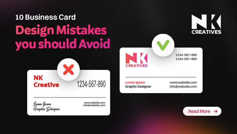
A common error involves stuffing too much content. People try to include every single detail imaginable. This approach makes your card look cluttered and messy. It overwhelms the recipient with excessive text.
Crucial business card information becomes lost in the visual noise. Your primary goal is clarity and conciseness here. Focus only on the most vital contact details. Include your name, title, company, phone, and email.
A website address is also highly recommended. Resist the urge to list every service offered. Too much text diminishes readability significantly. Remember, less is often genuinely more in design.
A clean, uncluttered card appears more sophisticated. It allows key business card information to stand out. This thoughtful approach creates professional business cards.
They are easier to read and remember effectively. Always prioritize impactful design over quantity.
2. Using Poor Quality Materials or Flimsy Stock
The physical feel of your card matters immensely. Flimsy paper stock conveys a cheap impression, suggesting a lack of care and attention to detail, which can subtly undermine your perceived value.
High-quality materials instantly feel more substantial. They communicate reliability and trustworthiness. Invest in durable, thick card stock for your cards. A matte or soft-touch finish adds a luxurious feel.
These tactile elements enhance the recipient's experience. They leave a lasting, positive physical impression. Cheap materials are a significant business card mistake.
They reflect poorly on your brand's commitment to quality. Professional business cards always utilize premium stock. This small investment yields significant returns.
It elevates your brand's image considerably. Always choose quality materials for your cards.
3. Choosing Illegible Fonts or Tiny Text Sizes
Readability is paramount for any business card. Selecting overly decorative or script fonts can hinder legibility. These fonts might look artistic, but are often hard to decipher. Similarly, using text that is too small is a major flaw.
Many people struggle to read tiny print easily. Your contact details must be instantly understandable. Choose clean, sans-serif fonts for optimal clarity. Ensure your font size is appropriate for all ages.
A minimum of 8pt for body text is generally advised. Headings and names should be larger for emphasis. This ensures all business card information is accessible.
Avoid light colors on light backgrounds for text. Contrast is vital for clear readability. This is a crucial aspect of good Business card design.
Ignoring legibility leads to frustrating experiences. Make sure your card is effortlessly readable.
4. Providing Incorrect or Outdated Contact Information
This seems obvious, yet it's a surprisingly common error. Distributing cards with old phone numbers is useless. An incorrect email address means lost opportunities. A broken website link frustrates potential clients.
Always double-check every piece of business card information. Verify all phone numbers, email addresses, and URLs. Even a single typo can render your card ineffective. This is a critical business card mistake to avoid.
Print a small batch first for final review. Ask several people to proofread the details. Ensuring accuracy builds trust and credibility. It shows meticulous attention to important details. Outdated cards are a waste of resources.
They actively harm your professional reputation. Keep your contact details current and precise. This ensures your professional business cards connect.
5. Neglecting Brand Consistency Across Materials
Your business card is an extension of your brand. It must align seamlessly with your overall identity. Inconsistent branding creates confusion for your audience.
Your card should use the same logo, colors, and fonts. These elements should match your website and marketing materials. Strong business card branding reinforces your company's image.
It builds instant recognition and trust with clients. Deviating from your brand guidelines is a notable business card mistake. It weakens your visual identity significantly.
Maintain a cohesive look across all platforms. This includes your social media profiles too. Consistency makes your brand memorable and reliable. It projects a unified and strong presence.
Ensure your card perfectly reflects your established brand. This is a key element of effective Business card design.
6. Ignoring the Importance of White Space
White space, or negative space, is often overlooked. It refers to the empty areas around design elements. A lack of white space makes a card feel cramped. It creates visual clutter and a busy appearance.
Ample white space allows elements to breathe. It guides the eye naturally through the design. It enhances readability and overall aesthetic appeal. This design principle is vital for clarity.
Cramming elements together is a common business card mistake. It makes your card appear unprofessional and amateurish. Thoughtful use of white space elevates the design.
It makes your card feel more sophisticated. It helps highlight the most important business card information. Embrace white space as a powerful design tool. It contributes significantly to professional business cards.
7. Making Poor Color Choices or Low Contrast
Colors play a significant role in perception. Clashing colors can be visually jarring and unpleasant. Low contrast between text and background makes reading difficult.
Your card should reflect your brand's color palette. Choose colors that complement each other harmoniously. Ensure there is sufficient contrast for all text.
Dark text on a light background is generally best. Reversing text (light on dark) needs careful consideration. Poor color choices are a common business card mistake. They can make your card hard to read.
They might also convey an unintended message. Consult color theory principles if unsure. A Best business card designer understands color dynamics. They can help you select the perfect palette.
Thoughtful color use enhances Business card design greatly. It makes your card visually appealing and effective.
8. Forgetting to Include a Clear Call to Action
Many business cards simply present contact details. They often miss a crucial element: a call to action. What do you want people to do next? Should they visit your website for more information? Perhaps follow you on social media platforms? Or maybe schedule a consultation directly?
A clear call to action guides the recipient. It prompts the desired next interaction step. Without it, your card is merely informative. It doesn't actively drive engagement forward.
This is a significant business card mistake to rectify. Consider a QR code linking to your portfolio. A simple "Visit Us Online" can be effective. Make your call to action concise and compelling.
It transforms your card into a powerful tool. This makes for truly professional business cards.
9. Skipping Professional Design and Doing It Yourself
While DIY seems cost-effective, it often backfires. Amateur designs frequently lack polish and impact. They might appear generic or poorly executed. This can deter potential clients immediately.
Your business card represents your brand. It should reflect quality and professionalism. Hiring the Best business card designer is a wise investment.
They possess expertise in layout, typography, and branding. A reputable Business card design agency offers comprehensive services. They understand how to create visually compelling cards.
Their insights can elevate your card significantly. Don't underestimate the power of expert design. Avoiding this business card mistake pays dividends.
A Best designer for business card ensures a strong impression. They craft professional business cards that stand out.
10. Not Proofreading Thoroughly for Errors
This is perhaps the most embarrassing mistake of all. Typos, misspellings, or grammatical errors are unacceptable. They instantly undermine your credibility and professionalism.
Such errors suggest carelessness and a lack of attention. Always proofread your business card meticulously. Read it aloud to catch awkward phrasing. Ask multiple trusted individuals to review it too.
A fresh pair of eyes often spots overlooked mistakes. This final check is critical. Distributing flawed business cards is a major business card mistake. It leaves a lasting negative impression on recipients.
Ensure every word is perfect and accurate. Flawless text presents a truly polished image. This attention to detail reflects positively on you. It ensures your professional business cards are impeccable.
Conclusion
Your business card is a tangible representation of your brand. Avoiding these common business card mistakes is essential. Implement these business card design tips for success.
Focus on clarity, quality, and consistency always. Invest in professional business cards that impress. Ensure all business card information is accurate and clear. Prioritize strong business card branding in your design. A well-designed card opens many doors. It leaves a lasting positive impression on everyone. Consider a Business card design agency for expert help.
The Best business card designer can make a difference. A Best designer for business card understands the impact. Make your card a powerful networking asset.
Don’t Let a Bad Card Ruin a Great First Impression. Get a custom-designed business card from the experts. Contact NK Creatives today!


.jpg)
.jpg)


.jpg)