


Understanding Responsive vs. Adaptive Web Design
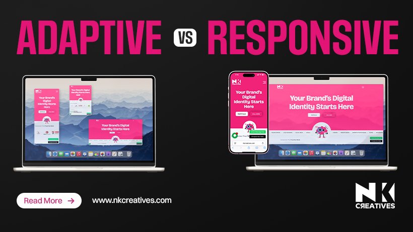
The digital landscape constantly evolves, demanding flexible website presentations. Modern web designers face crucial choices for optimal user experience. Two primary approaches dominate this critical discussion: responsive and adaptive design. Both aim to deliver content effectively across diverse devices. However, their underlying methodologies differ significantly in implementation. Understanding these distinctions is vital for successful online presence. This knowledge empowers businesses to make informed decisions for their platforms.
Responsive Web Design Explained
Responsive web design represents a single site adapting fluidly to its environment. It utilizes flexible grids, images, and media queries for this purpose. Imagine a website stretching or shrinking gracefully to fit any screen size. This approach ensures a consistent look and feel everywhere. A single codebase simplifies maintenance and future updates considerably. Many web design agency professionals favor this streamlined method today. It offers a unified experience across desktops, tablets, and smartphones.
How Responsive Design Works
At its core, responsive design employs three main principles. First, fluid grids use relative units like percentages instead of fixed pixels. This allows layout elements to resize proportionally with the viewport. Second, flexible images automatically scale down to prevent overflow issues. Images adjust their dimensions to fit within their designated containers. Third, CSS media queries apply different styles based on device characteristics. These characteristics include screen width, height, and resolution. For instance, navigation menus might transform into a hamburger icon on smaller screens. This ensures usability remains high regardless of the viewing device. A skilled web design agency leverages these tools expertly.
Advantages of Responsive Design
One major benefit is the single URL and HTML codebase. This significantly boosts search engine optimization (SEO) efforts. Google prefers responsive sites, making them rank higher in search results. Users also appreciate not being redirected to separate mobile versions. This creates a seamless browsing experience for everyone involved. Furthermore, responsive design is generally considered future-proof. It can accommodate new device sizes without requiring complete overhauls. Development costs might be higher initially, but long-term savings are significant. A dedicated web design agency can guide this complex process.
Disadvantages of Responsive Design
Despite its advantages, responsive design has some drawbacks. Sometimes, a "one size fits all" approach can lead to compromises. Desktop assets might be loaded on mobile devices, slowing page load times. This can negatively impact user experience and SEO rankings. Complex layouts can become challenging to manage responsively. Ensuring optimal performance across all breakpoints requires careful testing. Initial development can also be more time-consuming and expensive. Finding an experienced web design agency is crucial for success here. They possess the expertise to mitigate potential issues effectively.
Adaptive Web Design Explained
Adaptive web design, conversely, serves different layouts based on detected device characteristics. It presents distinct versions of a website for various screen sizes. Think of it as having several pre-designed templates. The server then delivers the most appropriate template to the user. This approach often prioritizes performance for specific devices. It aims for highly optimized experiences on each platform. Many web designers choose this for highly specialized applications.
How Adaptive Design Works
Adaptive design typically identifies the user's device at the server level. It then delivers one of several predefined layouts. Common breakpoints might include 320px, 480px, 768px, and 1024px. Each breakpoint has its own distinct HTML and CSS structure. This allows for fine-tuned control over the user experience. For instance, a mobile layout might completely omit certain desktop elements. This reduces data transfer and speeds up loading times significantly. This method requires careful planning by the web design agency. They define the specific breakpoints and corresponding layouts.
Advantages of Adaptive Design
A key advantage is the potential for faster page load times. Only necessary assets for a specific device are downloaded. This leads to a highly optimized and efficient user experience. Adaptive design offers greater control over the content presented. Web designers can tailor the experience precisely for each device type. This can be beneficial for complex applications or rich media sites. It allows for a truly customized interface on every platform. Performance-critical applications often benefit from this approach.
Disadvantages of Adaptive Design
The primary drawback is maintaining multiple codebases. Each breakpoint requires its own set of HTML and CSS files. This increases development time, complexity, and ongoing maintenance efforts. Introducing new device sizes means creating entirely new layouts. This lacks the inherent flexibility of responsive design. SEO can also be more challenging with multiple URLs or content versions. A dedicated web design agency must manage these complexities carefully. Ensuring consistency across all versions demands rigorous attention.
Key Differences Summarized
The fundamental difference lies in their approach to flexibility. Responsive design is fluid, adapting continuously to any screen size. Adaptive design is fixed, serving specific layouts for predefined breakpoints. Responsive uses a single codebase, while adaptive uses multiple. Performance can vary, with adaptive often being faster for initial loads. Maintenance is generally simpler with responsive due to its unified structure. Web designers consider these factors when choosing a strategy.
|
Feature |
Responsive Web Design |
Adaptive Web Design |
|
Approach |
Fluid, adapts to any screen size |
Fixed, serves specific layouts for predefined sizes |
|
Codebase |
Single codebase |
Multiple codebases (one per breakpoint) |
|
Flexibility |
Highly flexible, future-proof |
Less flexible, new devices need new layouts |
|
Performance |
Can be slower if not optimized |
Often faster due to optimized asset loading |
|
Maintenance |
Simpler, unified updates |
More complex, updates across multiple versions |
|
SEO Impact |
Generally better (single URL) |
Can be more challenging (multiple versions) |
|
Implementation |
Fluid grids, flexible images, media queries |
Server-side detection, predefined templates |
|
Control |
Less granular control over specific device layouts |
More granular control over each device's experience |
|
Complexity |
Initial setup can be complex |
Ongoing maintenance is more complex |
|
User Experience |
Consistent look, potentially slower load |
Optimized for device, potentially faster load |
|
Development Time |
Can be longer initially |
Can be quicker for specific breakpoints initially |
This table highlights the core distinctions between the two methodologies. Each has its strengths and weaknesses in application.
When to Choose Which Approach
The decision between responsive and adaptive depends on project requirements. Consider your target audience, content complexity, and budget constraints. For most general websites, responsive design is the preferred choice. It offers excellent SEO benefits and simplified long-term maintenance. Blogs, e-commerce sites, and corporate pages often benefit greatly. A reputable web design agency will typically recommend this first. It provides a broad reach with minimal ongoing fuss.
Adaptive design shines in specific scenarios requiring precise control. Applications with highly interactive elements might benefit from it. Legacy systems or content-heavy sites with performance demands could choose it. If you need to deliver a very specific experience per device, adaptive works. For instance, a complex web application might simplify its mobile interface. This ensures optimal functionality on smaller screens without compromise. Web designers carefully weigh these trade-offs.
The Role of Web Design Agency and Web Designers
Both responsive and adaptive strategies demand expertise. A professional web design agency plays a critical role in this decision. They analyze client needs, target audience, and business objectives. Their experience guides the selection of the most suitable design approach. They ensure the chosen method aligns with long-term goals.
Web designers within the agency execute the chosen strategy. They meticulously craft layouts, code interactions, and optimize performance. For responsive design, they focus on fluid grids and media queries. They ensure seamless transitions across countless screen dimensions. For adaptive design, they build distinct templates for each breakpoint. They optimize assets and content delivery for specific devices. Their technical skills and creative vision are paramount.
Furthermore, these professionals handle rigorous testing. They identify and rectify any display or functionality issues. They ensure the website performs flawlessly on all target devices. Post-launch, they provide ongoing support and updates. This ensures the website remains current and effective over time. Partnering with a skilled web design agency is an investment. It guarantees a high-quality, future-ready digital product. Their insights are invaluable for navigating this complex landscape.
Conclusion
Both responsive and adaptive web design offer viable solutions. They address the challenge of diverse device accessibility effectively. Responsive provides a fluid, unified experience with a single codebase. It is generally favored for its SEO benefits and ease of maintenance. Adaptive delivers highly optimized, device-specific experiences. It offers granular control but demands more complex maintenance. The best choice depends entirely on your project's unique needs. Consult with experienced web designers or a web design agency. They will help you navigate these technical considerations wisely. Ultimately, the goal is always to provide an exceptional user experience. This ensures your website thrives in today's multi-device world.


.jpg)
.jpg)


.jpg)