


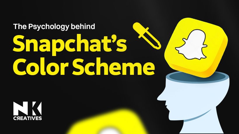
The Psychology Behind Snapchat’s Color Scheme – Why Yellow Works
Snapchat is a visual-first platform. It focuses on real-time sharing. Users send photos, not paragraphs. The design encourages quick visual communication.
In visual apps, color speaks volumes. It builds emotion, trust, and recall. Brand identity depends heavily on color. First impressions form in split seconds.
Yellow stands out in app stores. Most social apps choose blue tones. Why did Snapchat pick bright yellow? It’s not a common digital color.
This choice wasn’t just for looks. It’s grounded in color psychology in branding. Yellow triggers energy, playfulness, and excitement. It reflects Snapchat’s fast, youthful vibe. We’ll explore the branding strategy of Snapchat.
We’ll uncover the psychology behind yellow color. We’ll analyze the Snapchat user experience design. These factors shaped Snapchat’s unique identity.
Snapchat’s yellow isn’t accidental or random. It’s a bold, strategic design decision.
Let’s decode the logic behind yellow.
The Power of Color in Branding
Color theory plays a significant role in branding. It involves using specific colors to evoke emotions.
Emotional associations with colors shape consumer perceptions. For example, red is energetic and exciting, while blue is calm and trustworthy.
The science of color perception is crucial. Colors influence mood, memory, and decision-making. Red can trigger urgency, while blue promotes relaxation. Colors trigger deep emotional responses and memorable experiences.
Facebook uses blue to evoke trust. Blue conveys stability and reliability, which suits social media platforms. YouTube, on the other hand, uses red for excitement.
Red draws attention and conveys energy, making it ideal for video streaming. Brands like McDonald's use yellow for happiness.
Yellow is associated with optimism and warmth. Apple’s iconic white represents simplicity and elegance. Each brand selects colors based on desired emotional response and brand identity.
In today’s saturated app ecosystem, standing out is crucial. With countless apps in every category, color helps a brand be recognized. A unique color choice can enhance visibility and brand recall.
For effective branding, companies need to consider color psychology. Choosing the right color establishes strong emotional connections. Consistent use of color leads to better customer loyalty and recognition.
Color also affects user experience and app interaction. Bright, bold colors may attract attention, while muted tones can offer calmness. Understanding how colors impact users' feelings helps apps perform better.
Why Yellow? Psychology and Emotions
Yellow is sunshine captured in color. It radiates happiness, creativity, and warmth. This hue uplifts the human spirit.
It symbolizes joy, positivity, and curiosity. Yellow sparks youthful energy and spontaneity. Children respond quickly to this shade. It brings playful vibes and excitement. Yellow is freedom without hesitation or fear. Yellow grabs attention in seconds.
Used in advertising and safety signs, it ensures visibility and immediate recognition. That’s why taxis and helmets shine. Brands use yellow to stand out. Snapchat chose yellow for a reason. It reflects fun, boldness, and mischief. Perfect for their quirky brand tone.
Yellow sparks ideas and mental clarity. It’s the color of creative brand identity. Designers love its powerful emotional appeal. It adds life to visual storytelling. In marketing, yellow drives quick action. It’s used in call-to-action banner designs.
It pushes engagement without overwhelming viewers. A balance of charm and urgency. From logos to signs, yellow shines. It combines warmth with instant visibility. No other color is as dynamic.
It stays in memory longer too. This hue reflects cheer, not chaos. It’s bold yet calming when balanced. Perfect for brands targeting young minds. Yellow feels light, fresh, and free.
Snapchat’s Color Choice
Most social platforms use blue shades. Facebook, Twitter, LinkedIn all follow blue. Blue represents trust, calm, and connection. It’s a safe, widely accepted choice. Snapchat chose bright yellow instead. It’s bold, unique, and eye-catching. A rare color in app design. Snapchat app icon color psychology stands apart. This wasn’t just a random decision. Snapchat wanted to break visual patterns.
Snapchat branding strategy for visibility worked. Yellow creates instant visual disruption. App stores are crowded with blue. Homescreens blend with similar color tones. Snapchat’s yellow pops and grabs attention. That flash of yellow feels fresh.
Contrast is a powerful design principle. The brain reacts to unexpected visuals. Impact of app color choices is huge. Visual disruption increases brand recall. Yellow triggers feelings of fun, energy. It reflects Snapchat’s playful, youthful identity.
This aligns with their casual content. The color supports the user experience. Snapchat redefined social media color norms. Its choice built a strong identity. Snapchat icon stands out on homescreen daily. The color became part of branding.
Even without reading the name, users recognize the app by color. That’s brand power built through psychology. And through Snapchat yellow icon marketing strategy. While blue says calm and connection, yellow says fun, bold, and fast.
Snapchat knew how to be different. And they succeeded through smart design. Snapchat’s color choice wasn’t a risk. It was a calculated branding strategy. A splash of yellow made waves. And it still grabs attention today.
User Experience & Visual Impact
Snapchat uses yellow across designs. It appears beyond just the logo. The splash screen features bold yellow. Branding assets also highlight this shade. Yellow boosts Snapchat’s visual identity. It grabs attention in milliseconds. This vivid color is instantly recognizable. A consistent yellow builds brand recall. Snapchat creates a unique visual experience.
The color pops on every screen. It feels modern, fun, and bold. Yellow becomes a digital signature tone. Users connect yellow with fun moments. It’s linked to spontaneous, happy memories. This forms a strong emotional connection. Snapchat moments are bright and joyful. Yellow makes the platform feel alive.
It’s a bridge between tech and emotion. People remember colors more than text. Snapchat’s yellow supports memory and identity. It creates a memorable app experience. Users feel familiar with the design. It’s warm, playful, and instantly welcoming. That builds long-term user comfort quickly. This strategy increases social media app retention.
Yellow invites daily interaction and loyalty. It's effective for high re-engagement rates. Users return for the consistent visuals. Snapchat’s yellow stands out in feeds. It ensures a recognizable mobile app brand. Amid apps, yellow makes Snapchat unforgettable.
Few apps own a color like this. Snapchat’s UX is more than features. Its color scheme fuels emotional stickiness. This visual identity improves user satisfaction. Snapchat’s yellow is branding done right.
Brand Identity and Consistency
Snapchat built identity with bright yellow. Its app icon features Ghostface Chillah. Yellow became Snapchat’s visual signature.
This color choice wasn’t by chance. Snapchat used yellow as attention-grabber. It stands out in crowded apps. The bold color evokes fun energy.
It supports Snapchat’s youthful, playful vibe. From filters to logos, branding remains. Snapchat maintains visual identity with consistency. Yellow unifies its stories and features.
Every update stays true to style. Visual branding across social media platforms Snapchat ensures design looks the same. Whether it’s ads or mobile interface, You’ll always recognize the yellow tone. It strengthens recall and brand recognition.
Snapchat’s filters follow cohesive design language. Even sponsored lenses reflect core branding. Nothing feels off-brand or inconsistent. Users connect emotionally with this style.
Snapchat's color psychology in marketing Yellow signals creativity, joy, and excitement. These feelings align with app’s essence. Snapchat targets younger users through emotion.
Color plays a key strategic role. Consistent social media branding strategy Snapchat uses repetition to build trust. From email campaigns to promotional videos, Brand voice, visuals, and tone match. This creates a unified user experience. Snapchat brand storytelling with color Yellow acts as a visual anchor.
It guides attention during quick interactions. From Bitmoji to Discover page transitions, Yellow highlights what’s most important visually. Snapchat built identity through deliberate consistency. Yellow ties every feature and campaign. It’s not just a color—it's identity.
Comparing Other Apps’ Color Schemes
Instagram uses a warm gradient palette. It blends orange, pink, and purple. These shades evoke passion and creativity. This supports visual storytelling social media. TikTok adopts a dark neon theme. Black background contrasts red and blue. It feels edgy, bold, and modern. This fuels short video content creation.
Twitter sticks to a clean blue. Blue shows calm, trust, and clarity. It fits news, thoughts, and updates. Perfect for real-time microblogging platform. Now consider Snapchat’s bright yellow color.
It’s cheerful, energetic, and instantly noticeable. Yellow sparks joy, fun, and youth. Great for ephemeral photo messaging app. Where Instagram feels dreamy and artsy, Snapchat feels playful, simple, and fun.
Compared to TikTok’s bold, club-like vibe, Snapchat’s yellow is light and informal. Twitter’s blue suggests professionalism and thoughtfulness. Snapchat disrupts with sunny spontaneity. Yellow invites smiles, not serious debates. It appeals more to casual users. Each brand uses color psychology strategically.
Their palettes reflect tone and purpose. Snapchat’s contrast sets it apart visually. Color builds identity beyond just logo design. These apps don’t just entertain users. They anchor emotions through visual branding. Colors speak before words even appear. That’s power in mobile app color psychology.
How Designers Can Apply These Lessons
Choosing the right color builds trust. It shapes your brand's visual identity. Colors influence mood and user behavior.
A poor choice weakens your message. Strong brand color psychology in design can create emotional connection with users. Ask yourself: what emotion to evoke? Does this color reflect brand values? Will it stand out in competition? Is it accessible and easy to read? Research your audience's cultural color associations.
Test options with real user feedback. Use strategic color choices for branding to drive recognition and brand loyalty. Bold colors show confidence and energy. But don’t sacrifice harmony and function. Balance loud tones with calming neutrals. Apply boldness to limited UI areas. Ensure contrast meets accessibility standards.
Create contrast without overwhelming the layout. Follow UI color harmony best practices for consistent and pleasing visual flow. Experiment through A/B testing and prototyping. Use color tools to preview palettes. Test colors in different screen conditions.
Observe how colors affect navigation patterns. Track user engagement after color changes. Align boldness with your brand’s personality. Always focus on a seamless experience. Explore color palette testing for UX to refine choices with real data. Colors are not just decoration—they communicate. Smart, strategic use enhances brand success. Let data and emotion guide you.
Future of Color in Digital Branding
Color drives attention in digital spaces. Brands now design with mobile-first thinking. Smaller screens demand bolder visual choices. Bright hues ensure clarity and engagement.
Snapchat embraced yellow with confidence. Their bold color branding stood out. More brands may follow similar paths. Unique color schemes build instant recognition. AR technology is reshaping brand visuals. Interactive design needs adaptive color palettes.
Augmented reality color design evolves rapidly. Colors must blend with real surroundings. Dark mode is now a standard. Designers adapt with flexible color schemes. High contrast in dark mode branding keeps content readable and visually appealing.
Personalization brings dynamic visual identity shifts. User-based themes influence color decisions. Future color strategy for brands will depend on user interaction insights. The psychology of digital color branding will grow more critical over time.
Colors won’t just reflect — they’ll react. Expect mood-based color variations soon. Smartphones guide the color design strategy. Colors enhance UX in mobile design. As attention spans shorten, bold works. The future favors thoughtful, reactive hues.
Conclusion
Yellow evokes joy, energy, and optimism. Snapchat's yellow boosts instant recognition. Color shapes user perception and emotion. Designers must understand color psychology deeply. Yellow is more than just bright.
It conveys youth, excitement, and clarity. Snapchat’s bold color strategy drives engagement. Strong visual identity builds brand loyalty. Color impacts how users feel connected.
Unusual color combinations enhance visual storytelling. Successful digital design uses color intentionally. Stand out with color in design. Don't fear bold creative color choices. Explore emotional power of color palettes. Learn to create emotional design with color.
Give your brand the look it deserves with NK Creatives, the best branding agency for bold and memorable design.

.jpg)
.jpg)


.jpg)