


Understanding The Reason Behind Meta AI Logo Change
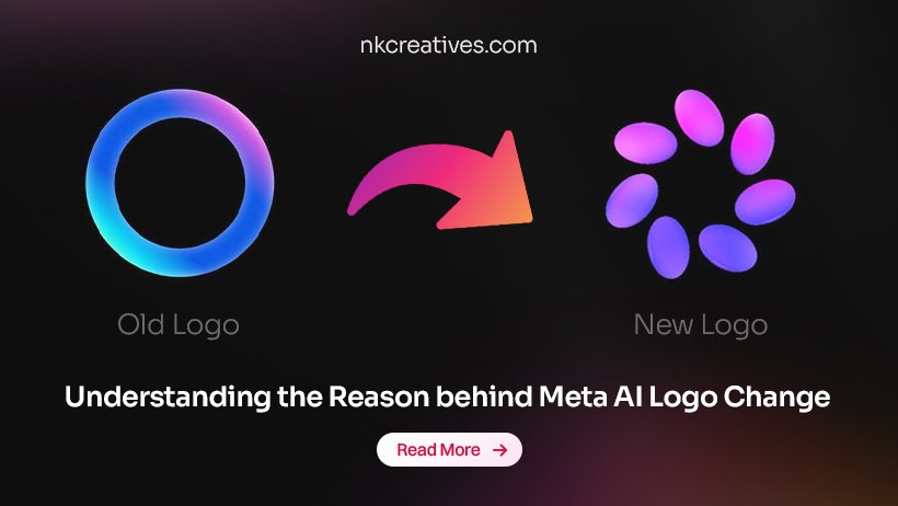
The evolution of the Meta AI logo in early 2026 is actually a big part of their shift from being "just a chatbot" to a core part of their infrastructure.
|
Feature |
Old Logo (2024–2025) |
New Logo (April 2026) |
|
Shape |
A perfect, static circle with a uniform stroke. |
A "Liquid Ring" that pulses and looks slightly 3D. |
|
Color |
A simple blue-to-purple gradient. |
Multi-layered Iridescence (shimmering teals, magentas, and electric blues). |
|
Visual State |
Static. It looked like a normal app button. |
Responsive. it "breathes" or glows while processing your request. |
|
Model Link |
Powered by Llama 3. |
Powered by the new Muse Spark model. |
The old logo was just a flat icon you tapped. The new one is designed to feel like a "living" entity.
It uses Lottie-based animations so that when you speak or type, the ring physically reacts to the "pitch" and "volume" of the interaction.
The new design uses a "shimmer" effect that resembles an oil slick or a soap bubble.
This is meant to represent the "fluidity" of AI that it can be anything from a writer to a coder or an artist.
A major change is the glow state. When the AI is using "Advanced Reasoning" (the deep-think mode released with Muse Spark), the ring expands and emits a soft light, signaling to the user that it's working on a complex task.
Why Meta Changed The Logo
1. Distancing from Social Media
Meta wanted a visual identity that felt separate from the Facebook "f" or the Instagram "camera." By moving toward a high-tech, iridescent ring, they are signaling that Meta AI is a standalone technology that can live on Smart Glasses or VR headsets, not just inside a social feed.
2. Branding "Intelligence"
As you know from your work in SEO and AEO (Answer Engine Optimization), the "answer" is now the product. The iridescent ring is becoming a "universal UI." Whether you are on WhatsApp, Ray-Ban Meta glasses, or a web browser, that specific ring tells you: "I am the intelligence here, ask me anything."
3. Competitive Edge
With competitors like OpenAI (the black hole/iris) and Google (the four-pointed Gemini star), Meta needed an iconic "hero" symbol. The "Infinity Ring" is their attempt to claim a shape that feels both futuristic and approachable.
4. Signaling the "Muse Spark" Era
Whenever a tech giant launches a new "frontier model" (like Muse Spark in 2026), they usually refresh the UI to make the upgrade feel tangible to the user. It’s a way of saying, "This isn't the same AI you used last year, it's smarter and faster."
Conclusion
The 2026 redesign marks Meta’s transition from a social media giant to an AI-first infrastructure company. By replacing static icons with a responsive, iridescent Liquid Ring, Meta signals that its intelligence is now a living, standalone entity. Unified across devices and powered by the advanced reasoning of the Muse Spark model.
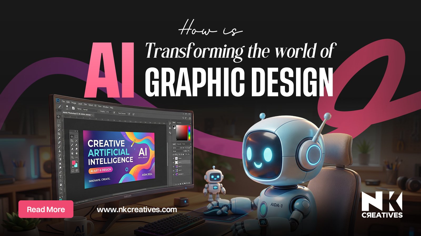
To understand the strategic significance of brand iconography and the methodology behind selecting a winning identity, explore the expert insights at NK Creatives.
.jpg)
.jpg)


.jpg)